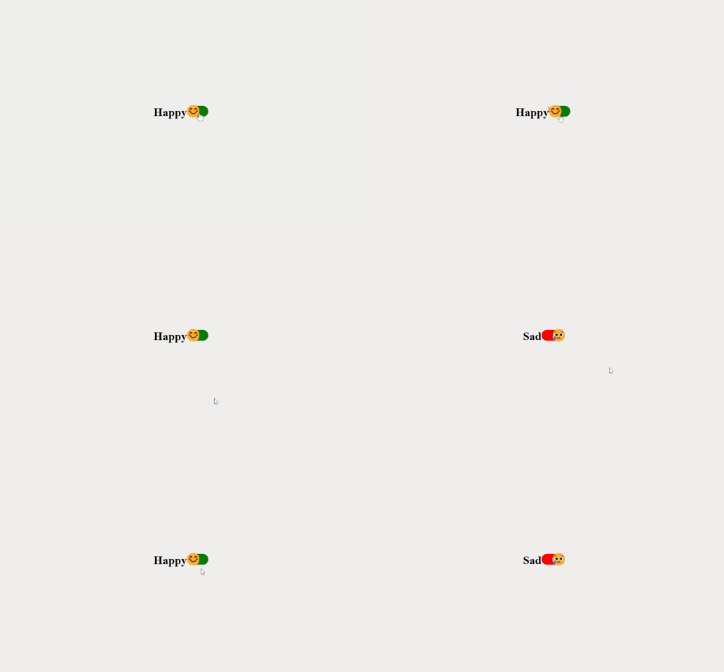
In today’s tutorial, we’re going to learn how to create an interactive toggle switcher that displays happy and sad faces using a combination of HTML, CSS, and JavaScript. This engaging UI element can add a touch of whimsy to your website while showcasing your coding skills. Let’s dive in!

Introduction
Toggle switchers are a popular UI element used to enable users to select between two distinct options. In this tutorial, we’ll not only create a functional toggle switcher but also integrate delightful happy and sad faces that dynamically change based on the user’s selection.
Toggle Switcher HTML Structure
To start off, let’s lay the foundation with our HTML structure:
<!DOCTYPE html>
<html lang="en">
    <head>
        <meta charset="UTF-8" />
        <meta name="viewport" content="width=device-width, initial-scale=1.0" />
        <title>Toggle Animation</title>
        <link rel="stylesheet" href="styles.css" />
    </head>
    <body>
        <h1 id="emotion-label">Happy</h1>
        <div class="toggle-container">
            <input type="checkbox" id="toggle" class="toggle-input" />
            <label class="toggle-label" for="toggle">
                <span class="toggle-figure"></span>
            </label>
        </div>

        <script src="script.js"></script>
    </body>
</html>
Styling with CSS
We’ll now proceed to style our toggle switcher using CSS. The styles will ensure the toggle switcher is visually appealing and responsive:
body {
    display: flex;
    justify-content: center;
    align-items: center;
    height: 100vh;
    margin: 0;
    background-color: #f0f0f0;
}

.toggle-container {
    position: relative;
}

.toggle-input {
    display: none;
}

.toggle-label {
    display: inline-block;
    width: 60px;
    height: 30px;
    background-color: green;
    border-radius: 15px;
    position: relative;
    cursor: pointer;
    transition: background-color 0.3s ease;
}

.toggle-input:checked + .toggle-label {
    background-color: red;
}

.toggle-figure {
    position: absolute;
    width: 30px;
    height: 30px;
    background-color: white;
    border-radius: 50%;
    transition: transform 0.3s ease;
}

.toggle-input:checked + .toggle-label .toggle-figure {
    transform: translateX(30px);
}

.toggle-figure:before {
    content: "😊"; /* Happy face emoji */
    font-size: 35px;
    position: absolute;
    top: 40%;
    left: 60%;
    transform: translate(-50%, -50%);
    transition: opacity 0.3s ease;
}

.toggle-input:checked + .toggle-label .toggle-figure:before {
    content: "😢"; /* Sad face emoji */
}
JavaScript (script.js):
const toggle = document.getElementById('toggle');
const emotionLabel = document.getElementById('emotion-label');

toggle.addEventListener('change', () => {
  if (toggle.checked) {
    emotionLabel.textContent = 'Sad';
  } else {
    emotionLabel.textContent = 'Happy';
  }
});
Conclusion
Congratulations! You’ve successfully created a toggle switcher with happy and sad faces using HTML, CSS, and JavaScript. This engaging UI element can be a delightful addition to your web projects, showcasing both your coding expertise and creativity.
Feel free to customize the design further, explore different animations, and even expand this concept to include more toggled elements. This tutorial serves as a solid starting point for creating interactive and playful UI elements that captivate your users.
Remember, by using this combination of HTML, CSS, and JavaScript, you’re not only enhancing the user experience but also building a strong foundation in web development.
Now, go ahead and experiment with your newly acquired skills, and have fun creating fantastic user interfaces!


