Introduction – Custom Loading Spinners in React using Tailwind CSS
In modern web applications, it’s important to provide a smooth and engaging user experience, even during data loading processes. Loading spinners are a common way to indicate to users that something is happening behind the scenes. In this tutorial, we’ll explore how to implement loading spinners in a React application using the popular utility-first CSS framework, Tailwind CSS.
Prerequisites
Before we begin, make sure you have the following prerequisites set up:
- Node.js and npm are installed on your machine.
- Basic understanding of React and JSX.
- Familiarity with Tailwind CSS.
Setting Up the Project
For this tutorial, we’ll use Vite, a fast development build tool, to set up our React project quickly. If you haven’t used Vite before, you can install it globally:
npm create vite@latestfollow the wizards and select react, typescript
Adding Tailwind CSS
npm install -D tailwindcss postcss autoprefixer
npx tailwindcss init -p
Follow this link – Install Tailwind CSS with Vite
Install below packages
npm i typewriter-effect @heroicons/reacCreating Loading Spinner Components
In this tutorial, we’ll create loading spinner components with different animations and styles. Here are a few examples:
Typewriter Text Loading Spinner

The TypewriterSpinner example introduces a loading spinner that showcases a dynamic typewriter-style text animation. This spinner engages users with an animated text that gradually appears as if it’s being typed out in real-time.
The TypewriterSpinner uses the Typewriter component from the typewriter-effect library to create the typewriter-style animation. Here’s how it works:
The animate-spin-slow class adds a slow rotation animation to the circular border, indicating that something is in progress.
import Typewriter from 'typewriter-effect';

const TypewriterSpinner = () => {
  return (
    <div className="flex flex-col items-center justify-center min-h-screen">
      <div className="animate-spin-slow rounded-full h-16 w-16 border-t-4 border-blue-500 border-solid"></div>
      <div className="mt-4 text-center">
        <p className="text-lg font-semibold text-gray-700">
          Loading site...
        </p>
        <h1 className="text-transparent text-3xl bg-clip-text bg-gradient-to-r from-blue-400 to-pink-600">
          <Typewriter
            options={{
              strings: [
                " When you have a dream, you've got to grab it and never let go.",
              ],
              autoStart: true,
              loop: false,
            }}
          />
        </h1>
      </div>
    </div>
  );
};

export default TypewriterSpinner;
Adding animate-spin-slow to tailwind.config.js
In your tailwind.config.js file, add the animate-spin-slow keyframe to enable the slow rotation animation for the spinner:
module.exports = {
  theme: {
    extend: {
      keyframes: {
        'spin-slow': {
          '0%': { transform: 'rotate(0deg)' },
          '100%': { transform: 'rotate(360deg)' },
        },
      },
      animation: {
        'spin-slow': 'spin-slow 3s linear infinite', // Adjust the duration as needed
      },
    },
  },
  variants: {},
  plugins: [],
};
Waving Hand with Image Loading Spinner
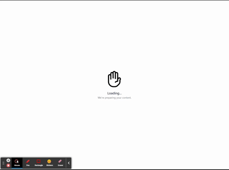
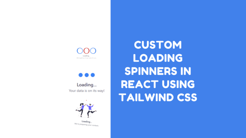
The LoadingSpinner2 example showcases a loading spinner that incorporates a waving hand animation along with an image. This spinner is designed to create a friendly and engaging loading experience for users.
In this example, we’re utilizing an SVG image of a waving hand, which adds a human touch to the loading process. The waving hand animation is achieved using Tailwind CSS classes that animate the hand’s opacity and translation. Here’s a breakdown of the key components of this spinner:
import hands from "../../../assets/svg/hands.svg";

const LoadingSpinner2 = () => {
    return (
        <div className="flex flex-col items-center justify-center min-h-screen">
            <div className="animate-waving-hand opacity-100 transform translate-y-0 duration-300">
                <img src={hands} alt="Welcome" className="w-24 h-24" />
            </div>
            <div className="mt-4 text-center">
                <p className="text-lg font-semibold text-gray-700">
                    Loading...
                </p>
                <p className="text-sm text-gray-500">
                    We're preparing your content.
                </p>
            </div>
        </div>
    );
};

export default LoadingSpinner2;
Adding animate-waving-hand to tailwind.config.js
In your tailwind.config.js file, add the animate-spin-slow keyframe to enable the slow rotation animation for the spinner:
module.exports = {
  theme: {
    extend: {
      keyframes: {
        wave: {
                "0%": { transform: "rotate(0.0deg)" },
                "10%": { transform: "rotate(14deg)" },
                "20%": { transform: "rotate(-8deg)" },
                "30%": { transform: "rotate(14deg)" },
                "40%": { transform: "rotate(-4deg)" },
                "50%": { transform: "rotate(10.0deg)" },
                "60%": { transform: "rotate(0.0deg)" },
                "100%": { transform: "rotate(0.0deg)" },
            },
      },
      animation: {
        "waving-hand": "wave 2s linear infinite",
      },
    },
  },
  variants: {},
  plugins: [],
};
Bouncing Dots with Text
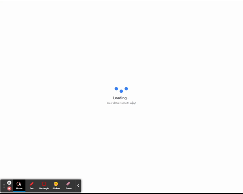
The LoadingSpinner3 example combines a set of bouncing dots with text to create a lively and informative loading spinner. This spinner not only conveys the loading progress but also communicates a message to users.
The LoadingSpinner3 incorporates animated dots that bounce in sequence along with loading text. The animate-bounce and animate-bounce2 classes provide the bouncing animation effect.
const LoadingSpinner3 = () => {
    return (
        <div className="flex flex-col items-center justify-center min-h-screen">
            <div className="flex space-x-2">
                <div className="h-4 w-4 rounded-full bg-blue-500 animate-bounce"></div>
                <div className="h-4 w-4 rounded-full bg-blue-500 animate-bounce2"></div>
                <div className="h-4 w-4 rounded-full bg-blue-500 animate-bounce"></div>
            </div>
            <div className="mt-4 text-center">
                <p className="text-lg font-semibold text-gray-700">
                    Loading...
                </p>
                <p className="text-sm text-gray-500">
                    Your data is on its way!
                </p>
            </div>
        </div>
    );
};

export default LoadingSpinner3;
Adding Bouncing Animations to tailwind.config.js
In your tailwind.config.js file, add the animate-bounce and animate-bounce2 keyframes to enable the bouncing animations for the dots:
module.exports = {
  theme: {
    extend: {
      keyframes: {
        bounce: {
          '0%, 100%': { transform: 'translateY(0)' },
          '50%': { transform: 'translateY(-6px)' },
        },
        'bounce2': {
          '0%, 100%': { transform: 'translateY(0)' },
          '50%': { transform: 'translateY(-3px)' },
        },
      },
      animation: {
        'bounce': 'bounce 0.5s infinite',
        'bounce2': 'bounce2 0.5s infinite',
      },
    },
  },
  variants: {},
  plugins: [],
};
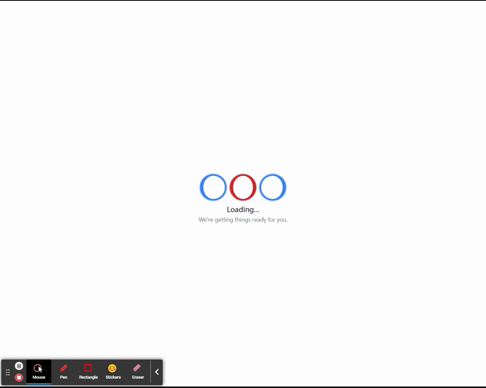
Rotating Scaled Dots with Text
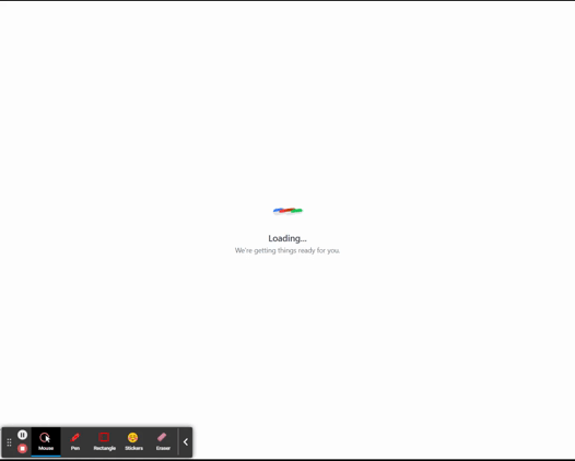
The LoadingSpinner4 example aims to provide a visually engaging loading experience. By combining rotation and scaling animations with alternating dot colors, the spinner offers a dynamic loading indicator. This type of spinner is suitable when you want to add a sense of motion and vibrancy to the loading process.
The LoadingSpinner4 incorporates a set of dots that alternate between scaled and non-scaled states as they rotate. The animate-spin-slow class adds a slow rotation animation to the dots, creating a sense of movement. The scale-0 and scale-100 classes control the scaling animation.
const LoadingSpinner4 = () => {
    return (
        <div className="flex flex-col items-center justify-center min-h-screen">
            <div className="w-12 h-12 flex">
                <div className="w-6 h-6 bg-blue-500 border-r-8 rounded-full transform origin-center scale-0 animate-spin-slow"></div>
                <div className="w-6 h-6 bg-red-500 border-r-4 rounded-full transform origin-center scale-100 animate-spin-slow"></div>
                <div className="w-6 h-6 bg-orange-700 border-r-8 rounded-full transform origin-center scale-100 animate-spin-slow"></div>
                <div className="w-6 h-6 bg-green-500 border-r-4 rounded-full transform origin-center scale-100 animate-spin-slow"></div>
            </div>
            <div className="mt-1 text-center">
                <p className="text-lg font-semibold text-gray-700">
                    Loading...
                </p>
                <p className="text-sm text-gray-500">
                    We're getting things ready for you.
                </p>
            </div>
        </div>
    );
};

export default LoadingSpinner4;
Adding animate-spin-slow to tailwind.config.js
In your tailwind.config.js file, add the animate-spin-slow keyframe to enable the slow rotation animation for the spinner:
module.exports = {
  theme: {
    extend: {
      keyframes: {
        'spin-slow': {
          '0%': { transform: 'rotate(0deg)' },
          '100%': { transform: 'rotate(360deg)' },
        },
      },
      animation: {
        'spin-slow': 'spin-slow 3s linear infinite', // Adjust the duration as needed
      },
    },
  },
  variants: {},
  plugins: [],
};
This configuration defines the spin-slow keyframe and applies it to the animate-spin-slow class with a 3-second duration, creating a leisurely spinning animation.
Chasing Dots with Text
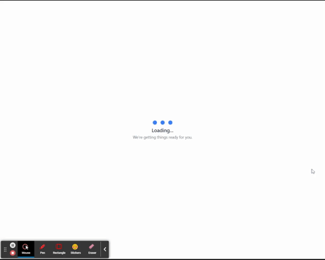
The LoadingSpinner5 is designed to offer an engaging and lively loading experience. By using the chasing dots animation, the spinner provides a sense of motion and progression during the loading process. This type of spinner is particularly suitable for applications that want to create an active and visually interesting loading indicator.
The animate-chase class is applied to each dot to create the chasing animation effect. This class is defined using the keyframes and animation configurations in the tailwind.config.js file.
const LoadingSpinner5 = () => {
    return (
        <div className="flex flex-col items-center justify-center min-h-screen">
            <div className="flex space-x-2">
                <div className="h-5 w-5 bg-blue-500 rounded-full transform scale-0 animate-chase"></div>
                <div className="h-5 w-5 bg-blue-500 rounded-full transform scale-0 animate-chase"></div>
                <div className="h-5 w-5 bg-blue-500 rounded-full transform scale-0 animate-chase"></div>
            </div>
            <div className="mt-1 text-center">
                <p className="text-lg font-semibold text-gray-700">
                    Loading...
                </p>
                <p className="text-sm text-gray-500">
                    We're getting things ready for you.
                </p>
            </div>
        </div>
    );
};

export default LoadingSpinner5;
Adding animate-chase to tailwind.config.js
In your tailwind.config.js file, add the animate-chase keyframe to enable the chasing animation for the dots:
module.exports = {
  theme: {
    extend: {
      keyframes: {
        'chase': {
          '0%, 100%': { transform: 'translateY(0) scale(0)' },
          '25%': { transform: 'translateY(-12px) scale(1)' },
          '50%': { transform: 'translateX(12px) scale(1)' },
          '75%': { transform: 'translateY(12px) scale(1)' },
        },
      },
      animation: {
        'chase': 'chase 2s linear infinite',
      },
    },
  },
  variants: {},
  plugins: [],
};
This configuration defines the chase keyframe and applies it to the animate-chase class with a 2-second duration, creating the chasing animation effect.
Glowing Pulse with Border
The LoadingSpinner6 is designed to offer a visually captivating loading experience. The combination of the rotating border and the glowing pulse animation adds an element of movement and intrigue to the loading indicator. This type of spinner is suitable for applications that want to engage users with a unique and visually appealing loading animation.
The animate-pulse-glow class adds a glowing pulse effect to the circular element. This class is defined using the keyframes and animation configurations in the tailwind.config.js file.
const LoadingSpinner6 = () => {
    return (
        <div className="flex flex-col items-center justify-center min-h-screen">
            <div className="flex items-center justify-center  space-x-2">
                <div className="w-16 h-16 border-4 border-blue-500 border-l-8 border-solid rounded-full animate-pulse-glow"></div>
                <div className="w-16 h-16 border-4 border-red-600 border-l-8  border-r-8 border-solid rounded-full animate-pulse-glow"></div>
                <div className="w-16 h-16 border-4 border-blue-500 border-r-8 border-solid rounded-full animate-pulse-glow"></div>
            </div>
            <div className="mt-8 text-center">
                <p className="text-lg font-semibold text-gray-700">
                    Loading...
                </p>
                <p className="text-sm text-gray-500">
                    We're getting things ready for you.
                </p>
            </div>
        </div>
    );
};

export default LoadingSpinner6;
Adding animate-pulse-glow to tailwind.config.js
In your tailwind.config.js file, add the animate-pulse-glow keyframe to enable the glowing pulse animation for the circular element:
module.exports = {
  theme: {
    extend: {
      keyframes: {
        "pulse-glow": {
                "0%, 100%": {
                    boxShadow: "0 0 0 0 rgba(59, 130, 246, 0.5)",
                    transform: "translateY(50%)",
                },
                "50%": {
                    boxShadow: "0 0 0 8px rgba(59, 130, 246, 0)",
                    transform: "translateY(0)",
                },
            },
      },
      animation: {
        'pulse-glow': 'pulse-glow 1.5s ease-in-out infinite',
      },
    },
  },
  variants: {},
  plugins: [],
};
This configuration defines the pulse-glow keyframe and applies it to the animate-pulse-glow class with a 1.5-second duration, creating the glowing pulse animation effect.
💁 Check out our other articles😃
👉 Generate a free Developer Portfolio website with AI prompts
👉 Creating a Toggle Switcher with Happy and Sad Faces using HTML, CSS, and JavaScript
Using the Loading Spinners
Now that we’ve created the loading spinner components and added the necessary styles, let’s use them in our main application.
In your src/App.tsx file, import the spinner components and use them within the app:
// src/App.tsx
import React from 'react';
//import LoadingSpinner from "./ui/loadingspinners/LoadingSpinner1";
//import LoadingSpinner2 from "./ui/loadingspinners/LoadingSpinner2";
//import LoadingSpinner3 from "./ui/loadingspinners/LoadingSpinner3";
//import LoadingSpinner4 from "./ui/loadingspinners/LoadingSpinner4";
//import LoadingSpinner5 from "./ui/loadingspinners/LoadingSpinner5";
import LoadingSpinner6 from "./ui/loadingspinners/LoadingSpinner6";

function App() {
  const [isLoading, setIsLoading] = useState(true);

    useEffect(() => {
        // Simulate loading delay for demonstration
        setTimeout(() => {
            setIsLoading(false);
        }, 10000);
    }, []);

    return (
        <div>
            {isLoading ? (
                <LoadingSpinner6 />
            ) : (
                // Your main content goes here
                <div className="text-center mt-8">
                    <p className="text-xl font-semibold text-green-600">
                        Download Complete!
                    </p>
                    <p className="text-sm text-gray-500">
                        Your motivation is ready to go.
                    </p>
                </div>
            )}
        </div>
}

export default App;
Running the Application
Start the development server:
npm run devOpen your browser and navigate to http://localhost:5173 to see the loading spinners in action!
Conclusion
In this tutorial, we learned how to implement various loading spinners in a React application using Tailwind CSS. By using custom animations and styles, we can create engaging and visually appealing loading experiences for users.
Feel free to experiment with different animations, colors, and shapes to match your application’s design. Remember that loading spinners should enhance the user experience by providing a clear indication that something is happening in the background.
Happy coding!