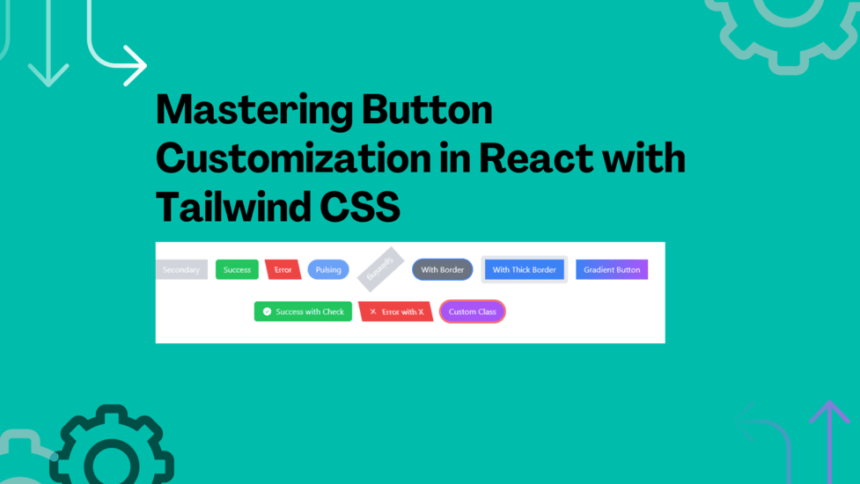
Button Customization in React with Tailwind CSS
Buttons are an essential part of user interfaces, providing users with interactive elements to perform actions. As such, it’s crucial to have buttons that not only function well but also match the overall design of your application. Tailwind CSS, a popular utility-first CSS framework, offers a seamless way to customize buttons with a wide range of styling options. In this tutorial, we’ll walk through step-by-step instructions on how to create and customize buttons using Tailwind CSS classes within a React application.
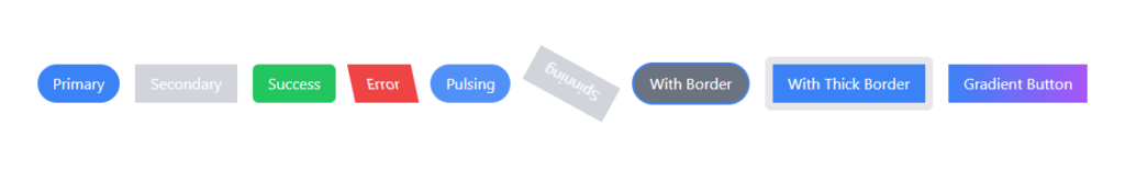
Let’s build a re-usable button component so that we can add amazing buttons like those below
Prerequisites
Before we begin, ensure you have the following prerequisites:
- Basic knowledge of React and JavaScript.
- Familiarity with Tailwind CSS.
Setting Up the Project
For this tutorial, we’ll use Vite, a fast development build tool, to set up our React project quickly. If you haven’t used Vite before, you can install it globally:
npm create vite@latestfollow the wizards and select react, typescript
Adding Tailwind CSS
npm install -D tailwindcss postcss autoprefixer
npx tailwindcss init -p
npm install @heroicons/react tailwindcss tailwind-merge
Follow this link – Install Tailwind CSS with Vite
Creating a Reusable Button Component
Creating a reusable Button component allows us to define button styling once and reuse it throughout our application. Let’s set up our Button component:
- In the
src/componentsdirectory, create a new file namedButton.tsx(or.jsx):
import React from 'react';

const Button = ({ children, className }) => {
  return (
    <button
      className={`py-2 px-4 bg-blue-500 text-white rounded ${className}`}
    >
      {children}
    </button>
  );
};

export default Button;
In this basic example, our Button component renders a button element with a default blue background and white text. The className prop allows for additional customization.
Basic Button Styling
Now let’s explore how to apply basic styling to our Button component:
- Open your
src/App.tsx file and import theButtoncomponent:
import React from 'react';
import Button from './components/ui/Button';
function App() {
return (
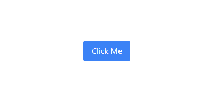
<div className="flex justify-center items-center h-screen">
<Button>Click Me</Button>
</div>
);
}
export default App;
Run the development server:
npm run devYou’ll now see a centered button with the default styling. Let’s proceed to customize it further.
Adding Shape Variations
Buttons come in various shapes. Let’s see how we can apply different shapes to our Button component:
- Modify the
Button.tsxcomponent to accept ashapeprop:
import React from 'react';

const Button = ({ children, className, shape }) => {
  let shapeClasses = '';
  if (shape === 'rounded') {
    shapeClasses = 'rounded-full';
  } else if (shape === 'square') {
    shapeClasses = 'rounded-none';
  } else if (shape === 'rectangle') {
    shapeClasses = 'rounded-md';
  }

  return (
    <button
      className={`py-2 px-4 bg-blue-500 text-white ${shapeClasses} ${className}`}
    >
      {children}
    </button>
  );
};

export default Button;
In your src/App.tsx file, pass the shape prop to the Button component:
import React from 'react';
import Button from './components/ui/Button';
function App() {
return (
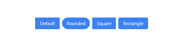
<div className="flex justify-center items-center h-screen space-x-4">
<Button>Default</Button>
<Button shape="rounded">Rounded</Button>
<Button shape="square">Square</Button>
<Button shape="rectangle">Rectangle</Button>
</div>
);
}
export default App;
Now, the buttons will take on different shapes based on the shape prop passed.
Applying Animations
Adding animations to buttons can enhance user engagement. Let’s see how to incorporate animations using Tailwind CSS classes:
- Modify the
Button.tsxanimationprop:
import React from 'react';

const Button = ({ children, className, shape, animation }) => {
  let shapeClasses = '';
  if (shape === 'rounded') {
    shapeClasses = 'rounded-full';
  } else if (shape === 'square') {
    shapeClasses = 'rounded-none';
  } else if (shape === 'rectangle') {
    shapeClasses = 'rounded-md';
  }

  let animationClasses = '';
  if (animation === 'pulse') {
    animationClasses = 'animate-pulse';
  } else if (animation === 'spin') {
    animationClasses = 'animate-spin';
  }

  return (
    <button
      className={`py-2 px-4 bg-blue-500 text-white ${shapeClasses} ${animationClasses} ${className}`}
    >
      {children}
    </button>
  );
};

export default Button;
In your src/App.tsx file, pass the animation prop to the Button component:
import React from 'react';
import Button from './components/ui/Button';
function App() {
return (
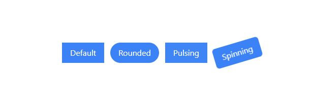
<div className="flex justify-center items-center h-screen space-x-4">
<Button>Default</Button>
<Button shape="rounded">Rounded</Button>
<Button shape="square" animation="pulse">
Pulsing
</Button>
<Button shape="rectangle" animation="spin">
Spinning
</Button>
</div>
);
}
export default App;
Update the tailwind.config.js with these animations
/** @type {import('tailwindcss').Config} */
export default {
    content: ["./index.html", "./src/**/*.{js,ts,jsx,tsx}"],
    theme: {
        extend: {},
        keyframes: {
            spin: {
                "0%": { transform: "rotate(0deg)" },
                "100%": { transform: "rotate(360deg)" },
            },

            "pulse-glow": {
                "0%, 100%": {
                    boxShadow: "0 0 0 0 rgba(59, 130, 246, 0.5)",
                    transform: "translateY(50%)",
                },
                "50%": {
                    boxShadow: "0 0 0 8px rgba(59, 130, 246, 0)",
                    transform: "translateY(0)",
                },
            },
        },
        animation: {
            "spin-slow": "spin 3s linear infinite",
            "pulse-glow": "pulse-glow 1s infinite",
        },
    },
    plugins: [],
};
Now, buttons with animations will display the specified animation effect.
Styling with Borders
Borders can provide visual separation and highlight buttons. Let’s see how to add borders to buttons:
- Modify the
Button.tsxborderprop:
import React from 'react';

const Button = ({ children, className, shape, animation, border }) => {
    let shapeClasses = "";
    if (shape === "rounded") {
        shapeClasses = "rounded-full";
    } else if (shape === "square") {
        shapeClasses = "rounded-none";
    } else if (shape === "rectangle") {
        shapeClasses = "rounded-md";
    }

    let animationClasses = "";
    if (animation === "pulse") {
        animationClasses = "animate-pulse-glow";
    } else if (animation === "spin") {
        animationClasses = "animate-spin-slow";
    }

    let borderClasses = "";
    if (border) {
        borderClasses = "border-4";
    }

    return (
        <button
            className={`py-2 px-4 bg-blue-500 text-white ${shapeClasses} ${animationClasses} ${borderClasses} ${className}`}
        >
            {children}
        </button>
    );
};
export default Button;
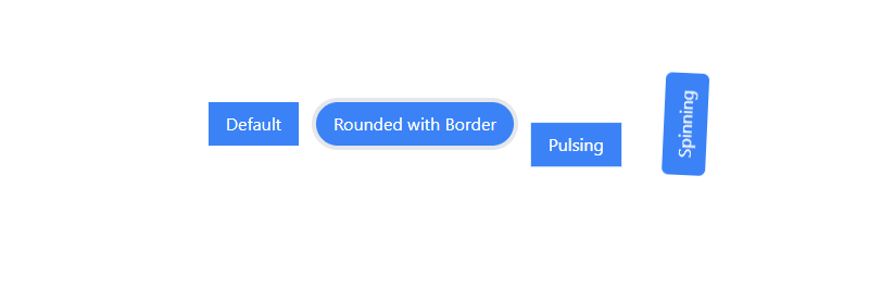
In your src/App.tsx file, pass the border prop to the Button component:
import React from 'react';
import Button from './components/ui/Button';

function App() {
  return (
    <div className="flex justify-center items-center h-screen space-x-4">
      <Button>Default</Button>
      <Button shape="rounded" border>
        Rounded with Border
      </Button>
      <Button shape="square" animation="pulse">
        Pulsing
      </Button>
      <Button shape="rectangle" animation="spin">
        Spinning
      </Button>
    </div>
  );
}

export default App;
Implementing Gradient Colors
Gradient colors can add depth and visual interest to buttons. Let’s see how to apply gradient colors:
- Modify the
Button.tsxcomponent to accept agradientprop:
import React from 'react';
const Button = ({ children, className, shape, animation, border, gradient }) => {
let shapeClasses = '';
if (shape === 'rounded') {
shapeClasses = 'rounded-full';
} else if (shape === 'square') {
shapeClasses = 'rounded-none';
} else if (shape === 'rectangle') {
shapeClasses = 'rounded-md';
}
let animationClasses = '';
if (animation === 'pulse') {
animationClasses = 'animate-pulse';
} else if (animation === 'spin') {
animationClasses = 'animate-spin';
}
let borderClasses = '';
if (border) {
borderClasses = 'border';
}
let gradientClasses = '';
if (gradient) {
gradientClasses = `bg-gradient-to-r ${gradient}`;
}
return (
<button
className={`py-2 px-4 text-white ${shapeClasses} ${animationClasses} ${borderClasses} ${gradientClasses} ${className}`}
>
{children}
</button>
);
};
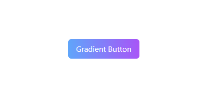
export default Button;In your src/App.tsx file, pass the gradient prop to the Button component:
import React from 'react';
import Button from './components/ui/Button';

function App() {
  return (
    <div className="flex justify-center items-center h-screen space-x-4">
      <Button>Default</Button>
      <Button shape="rounded" border>
        Rounded with Border
      </Button>
      <Button shape="square" animation="pulse">
        Pulsing
      </Button>
      <Button shape="rectangle" animation="spin">
        Spinning
      </Button>
      <Button shape="rectangle" gradient="from-blue-400 to-purple-500">
        Gradient Button
      </Button>
    </div>
  );
}

export default App;
Now, buttons with the gradient prop will have gradient backgrounds.
Adding Icons to Buttons
Icons can enhance button visuals and provide context. Let’s see how to integrate icons using Hero Icons:
- Modify the
Button.tsx component to accept aniconprop:
import React from 'react';
import { twMerge } from 'tailwind-merge';

const Button = ({
    children,
    className,
    shape,
    animation,
    border,
    gradient,
    icon: IconComponent,
}) => {
    let shapeClasses = "";
    if (shape === "rounded") {
        shapeClasses = "rounded-full";
    } else if (shape === "square") {
        shapeClasses = "rounded-none";
    } else if (shape === "rectangle") {
        shapeClasses = "rounded-md";
    }

    let animationClasses = "";
    if (animation === "pulse") {
        animationClasses = "animate-pulse-glow";
    } else if (animation === "spin") {
        animationClasses = "animate-spin-slow";
    }

    let borderClasses = "";
    if (border) {
        borderClasses = "border";
    }

    let gradientClasses = "";
    if (gradient) {
        gradientClasses = `bg-gradient-to-r ${gradient}`;
    }

    return (
        <button
            className={twMerge(
                "flex py-2 bg-blue-500 px-4 text-white",
                shapeClasses,
                animationClasses,
                borderClasses,
                gradientClasses,
                className
            )}
        >
            {IconComponent && <IconComponent className="h-5 w-5 mr-2" />}
            {children}
        </button>
    );
};

export default Button;
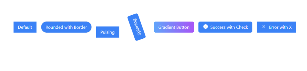
In your src/App.tsx file, import the necessary Hero Icons and pass the icon prop to the Button component:
import React from 'react';
import Button from './components/ui/Button';
import { CheckCircleIcon, XMarkIcon } from '@heroicons/react/outline';

function App() {
  return (
    <div className="flex justify-center items-center h-screen space-x-4">
      <Button>Default</Button>
      <Button shape="rounded" border>
        Rounded with Border
      </Button>
      <Button shape="square" animation="pulse">
        Pulsing
      </Button>
      <Button shape="rectangle" animation="spin">
        Spinning
      </Button>
      <Button shape="rectangle" gradient="from-blue-400 to-purple-500">
        Gradient Button
      </Button>
      <Button shape="rectangle" icon={CheckCircleIcon}>
        Success with Check
      </Button>
      <Button shape="skew" icon={XMarkIcon}>
        Error with X
      </Button>
    </div>
  );
}

export default App;
With this setup, buttons can display Hero Icons as well as apply other customizations.
React Props
interface ButtonProps {
    label: string;
    color: "primary" | "secondary" | "default" | "success" | "error";
    shape: "rounded" | "square" | "rectangle" | "skew";
    onClick: () => void;
    disabled?: boolean;
    loading?: boolean;
    animation?: "none" | "pulse" | "spin";
    hasBorder?: boolean;
    borderWidth?: "none" | "thin" | "thick";
    borderColor?: string;
    gradient?: string; // New prop for gradient colors
    icon?: React.FC<React.ComponentProps<typeof BeakerIcon>>; // Update the icon prop type
    className?: string;
}
label: This prop is of typestringand is required. It specifies the text that will be displayed on the button.color: This prop is of type"primary" | "secondary" | "default" | "success" | "error". It specifies the color scheme of the button. It is required and can take one of the predefined color values.shape: This prop is of type"rounded" | "square" | "rectangle" | "skew". It defines the shape of the button. It is required and can take one of the predefined shape values.onClick: This prop is a function that gets executed when the button is clicked. It is required and must be provided to define the button’s click behavior.disabled: This prop is of typebooleanand is optional. When set totrue, the button becomes disabled and can’t be clicked.loading: This prop is of typebooleanand is optional. When set totrue, the button displays a loading state, indicating that some action is being processed.animation: This prop is of type"none" | "pulse" | "spin"and is optional. It specifies the animation effect applied to the button. It can be used to add visual interest to the button.hasBorder: This prop is of typebooleanand is optional. When set totrue, the button gets a border.borderWidth: This prop is of type"none" | "thin" | "thick"and is optional. It determines the width of the button’s border whenhasBorderistrue.borderColor: This prop is of typestringand is optional. It specifies the color of the button’s border whenhasBorderistrue.gradient: This prop is of typestringand is optional. It allows you to apply a gradient color effect to the button, transitioning from one color to another.icon: This prop is of typeReact.FC<React.ComponentProps<typeof BeakerIcon>>and is optional. It allows you to pass an icon component (from Hero Icons) to be displayed alongside the button label.className: This prop is of typestringand is optional. It provides a way to add additional custom classes to the button for further styling or customization.
By using these props, you can create versatile and highly customizable buttons in your React application. The combination of these props allows you to control various aspects of the button’s appearance, behavior, and interaction, making it suitable for different design requirements and user experiences.
💁 Check out our other articles😃
👉 Generate a free Developer Portfolio website with AI prompts
👉 Creating a Toggle Switcher with Happy and Sad Faces using HTML, CSS, and JavaScript
Complete Code snippet for you
import React from "react";
import { twMerge } from "tailwind-merge";

import { BeakerIcon } from "@heroicons/react/24/outline";


interface ButtonProps {
    label: string;
    color: "primary" | "secondary" | "default" | "success" | "error";
    shape: "rounded" | "square" | "rectangle" | "skew";
    onClick: () => void;
    disabled?: boolean;
    loading?: boolean;
    animation?: "none" | "pulse" | "spin";
    hasBorder?: boolean;
    borderWidth?: "none" | "thin" | "thick";
    borderColor?: string;
    gradient?: string; // New prop for gradient colors
    icon?: React.FC<React.ComponentProps<typeof BeakerIcon>>; // Update the icon prop type
    className?: string;
}

const Button: React.FC<ButtonProps> = ({
    label,
    color,
    onClick,
    disabled,
    loading,
    animation = "none",
    hasBorder,
    borderWidth = "none",
    borderColor = "transparent",
    gradient, // Add the gradient prop
    icon: IconComponent, // Use the icon prop as a component
    shape,
    className,
}) => {
    /**
     * Get the background color classes based on the color prop.
     * If gradient is specified, use the gradient classes.
     * @returns {string} Background color classes.
     */
    const getColorClasses = () => {
        if (gradient) {
            return `bg-gradient-to-r ${gradient}`;
        }
        switch (color) {
            case "primary":
                return "bg-blue-500 hover:bg-blue-600";
            case "secondary":
                return "bg-gray-300 hover:bg-gray-400";
            case "success":
                return "bg-green-500 hover:bg-green-600";
            case "error":
                return "bg-red-500 hover:bg-red-600";
            default:
                return "bg-gray-500 hover:bg-gray-600";
        }
    };

    /**
     * Get the shape-related classes based on the shape prop.
     * @returns {string} Shape-related classes.
     */
    const getShapeClasses = () => {
        switch (shape) {
            case "rounded":
                return "rounded-full";
            case "square":
                return "rounded-none";
            case "rectangle":
                return "rounded-md";
            case "skew":
                return "transform skew-x-12";
            default:
                return "rounded-md";
        }
    };

    /**
     * Get the animation-related classes based on the animation prop.
     * @returns {string} Animation-related classes.
     */
    const getAnimationClasses = () => {
        switch (animation) {
            case "pulse":
                return "animate-pulse-slow";
            case "spin":
                return "animate-spin-slow";
            default:
                return "";
        }
    };

    /**
     * Get the border-related classes based on the hasBorder, borderWidth, and borderColor props.
     * @returns {string} Border-related classes.
     */
    const getBorderClasses = () => {
        const borderClass = hasBorder ? "border" : "";
        const borderWidthClass =
            borderWidth === "thin"
                ? "border-2"
                : borderWidth === "thick"
                ? "border-8"
                : "";
        const borderColorClass = `border-${borderColor}`;

        return `${borderClass} ${borderWidthClass} ${borderColorClass}`;
    };

    /**
     * Render the icon component if provided.
     * @returns {React.ReactNode} Icon component.
     */
    const renderIcon = () => {
        if (IconComponent) {
            return <IconComponent className="h-5 w-5 mr-2" />;
        }
        return null;
    };

    return (
        <button
            className={twMerge(
                "flex items-center px-4 py-2",
                getColorClasses(),
                "text-white transition duration-300 ease-in-out",
                disabled ? "opacity-50 cursor-not-allowed" : "",
                getShapeClasses(),
                getAnimationClasses(),
                getBorderClasses(),
                className // Use the passed className prop
            )}
            onClick={onClick}
            disabled={disabled || loading}
        >
            {renderIcon()}
            {loading ? "Loading..." : label}
        </button>
    );
};

export default Button;
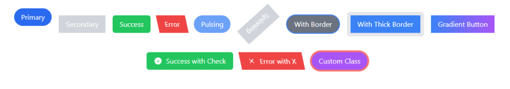
import React, { useState } from "react";
import Button from "./ui/Button";
import { CheckCircleIcon } from "@heroicons/react/24/solid";
import { XMarkIcon } from "@heroicons/react/20/solid";

const ButtonTest: React.FC = () => {
    const [buttonState, setButtonState] = useState("");

    const handleButtonClick = (state: string) => {
        setButtonState(state);
        // Simulating an asynchronous action, e.g., an API call
        setTimeout(() => {
            console.log(`Button clicked with state: ${state}`);
            setButtonState("");
        }, 2000);
    };

    return (
        <div className="flex flex-wrap justify-center items-center h-screen space-x-4">
            {/* Standard buttons */}
            <Button
                label="Primary"
                color="primary"
                shape="rounded"
                onClick={() => handleButtonClick("primary")}
                loading={buttonState === "primary"}
            />
            <Button
                label="Secondary"
                color="secondary"
                shape="square"
                onClick={() => handleButtonClick("secondary")}
                loading={buttonState === "secondary"}
            />
            <Button
                label="Success"
                color="success"
                shape="rectangle"
                onClick={() => handleButtonClick("success")}
                loading={buttonState === "success"}
            />
            <Button
                label="Error"
                color="error"
                shape="skew"
                onClick={() => handleButtonClick("error")}
                loading={buttonState === "error"}
            />

            {/* Animated buttons */}
            <Button
                label="Pulsing"
                color="primary"
                shape="rounded"
                onClick={() => handleButtonClick("pulsing")}
                loading={buttonState === "pulsing"}
                animation="pulse"
            />
            <Button
                label="Spinning"
                color="secondary"
                shape="square"
                onClick={() => handleButtonClick("spinning")}
                loading={buttonState === "spinning"}
                animation="spin"
            />

            {/* Buttons with borders */}
            <Button
                label="With Border"
                color="default"
                shape="rounded"
                onClick={() => handleButtonClick("withBorder")}
                loading={buttonState === "withBorder"}
                hasBorder
                borderWidth="thin"
                borderColor="blue-500"
            />
            <Button
                label="With Thick Border"
                color="primary"
                shape="rectangle"
                onClick={() => handleButtonClick("withThickBorder")}
                loading={buttonState === "withThickBorder"}
                hasBorder
                borderWidth="thick"
                borderColor="yellow-500"
            />

            {/* Gradient button */}
            <Button
                label="Gradient Button"
                color="default"
                shape="square"
                onClick={() => handleButtonClick("gradient")}
                loading={buttonState === "gradient"}
                gradient="from-blue-500 to-purple-500"
            />

            {/* Buttons with icons */}
            <Button
                label="Success with Check"
                color="success"
                shape="rectangle"
                onClick={() => handleButtonClick("successWithCheck")}
                loading={buttonState === "successWithCheck"}
                icon={CheckCircleIcon} // Pass the Hero Icon component
            />
            <Button
                label="Error with X"
                color="error"
                shape="skew"
                onClick={() => handleButtonClick("errorWithX")}
                loading={buttonState === "errorWithX"}
                icon={XMarkIcon} // Pass the Hero Icon component
            />

            {/* Button with custom class */}
            <Button
                label="Custom Class"
                color="primary"
                shape="rounded"
                onClick={() => handleButtonClick("customClass")}
                loading={buttonState === "customClass"}
                className="border-4 border-red-400 bg-purple-500" // Pass the additional class using the `className` prop
            />
        </div>
    );
};

export default ButtonTest;
Conclusion
In this tutorial, we’ve explored how to create and customize buttons using Tailwind CSS classes within a React application. We’ve covered various customization options, including shapes, animations, borders, gradients, and icons. By combining the power of Tailwind CSS with React, you can create visually appealing and interactive buttons that match your application’s design and functionality.
Feel free to experiment further with Tailwind CSS’s extensive utility classes and Hero Icons to create buttons that suit your project’s unique needs and style. Happy coding!